A modern redesign of the Nike Shoes app focused on improving user experience, simplifying navigation, and enhancing the overall visual appeal to better connect with Nike’s athletic audience.
Client
Nike Shoes App
Year
2025
Live Project
Project Overview
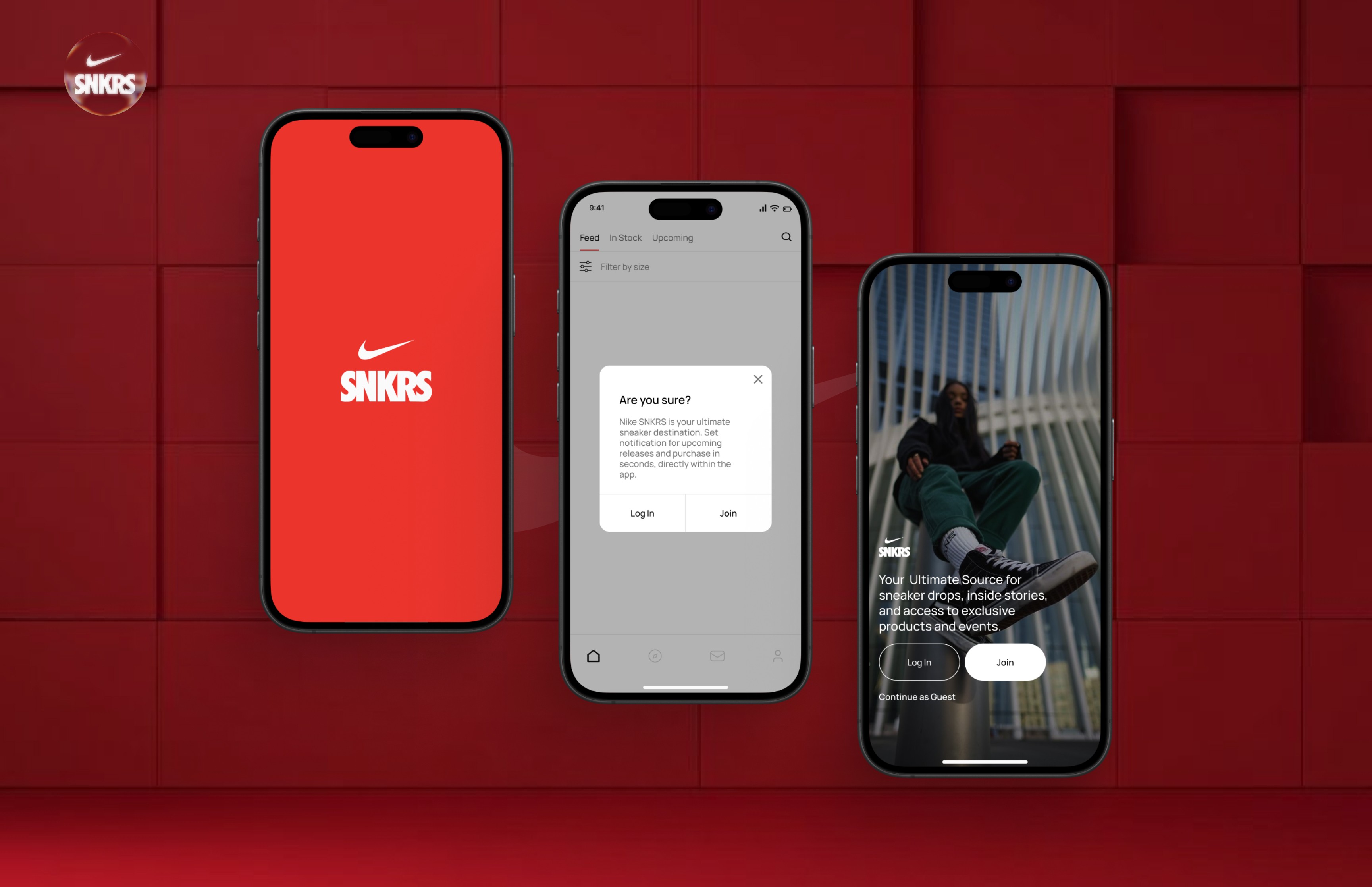
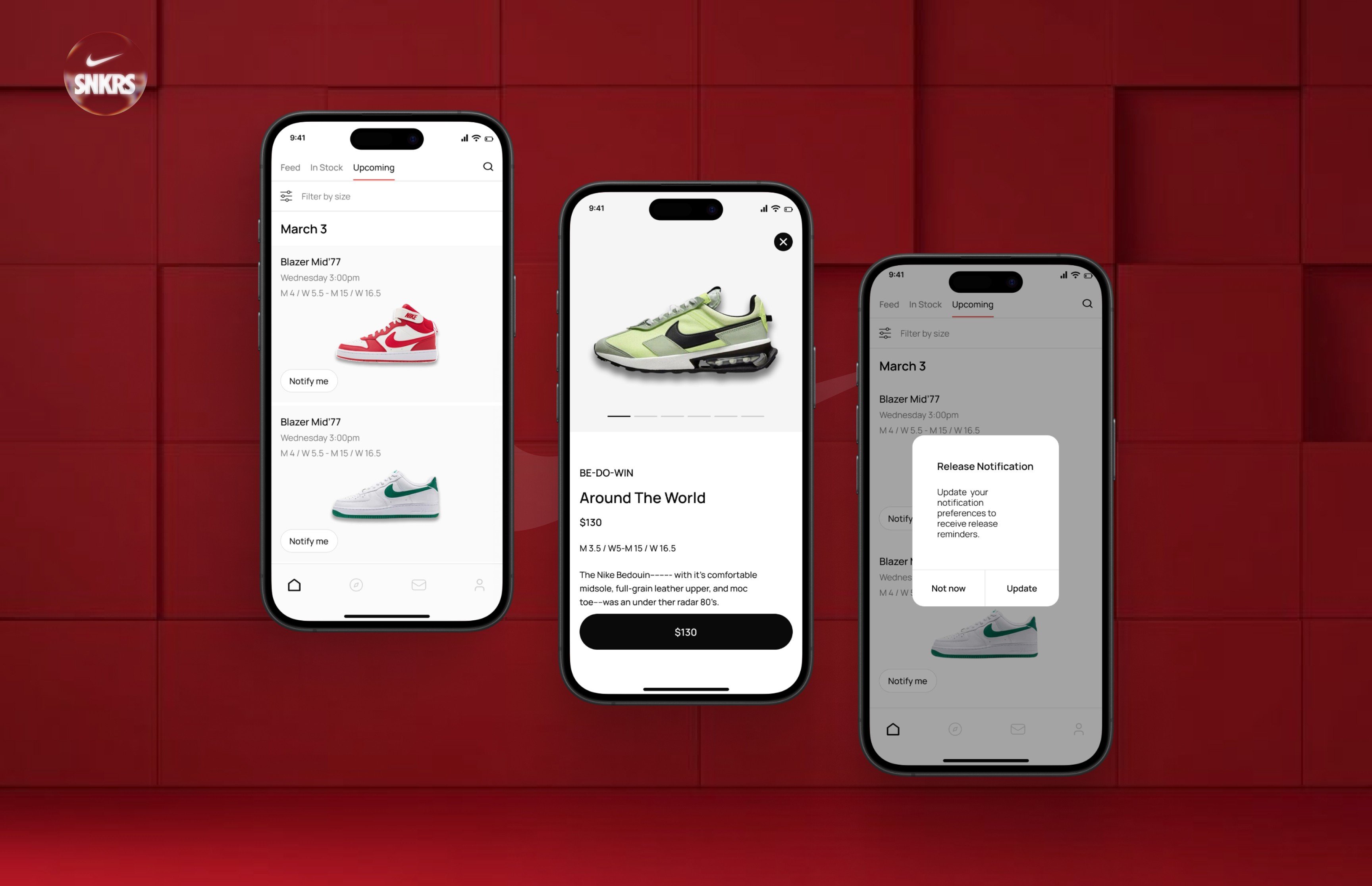
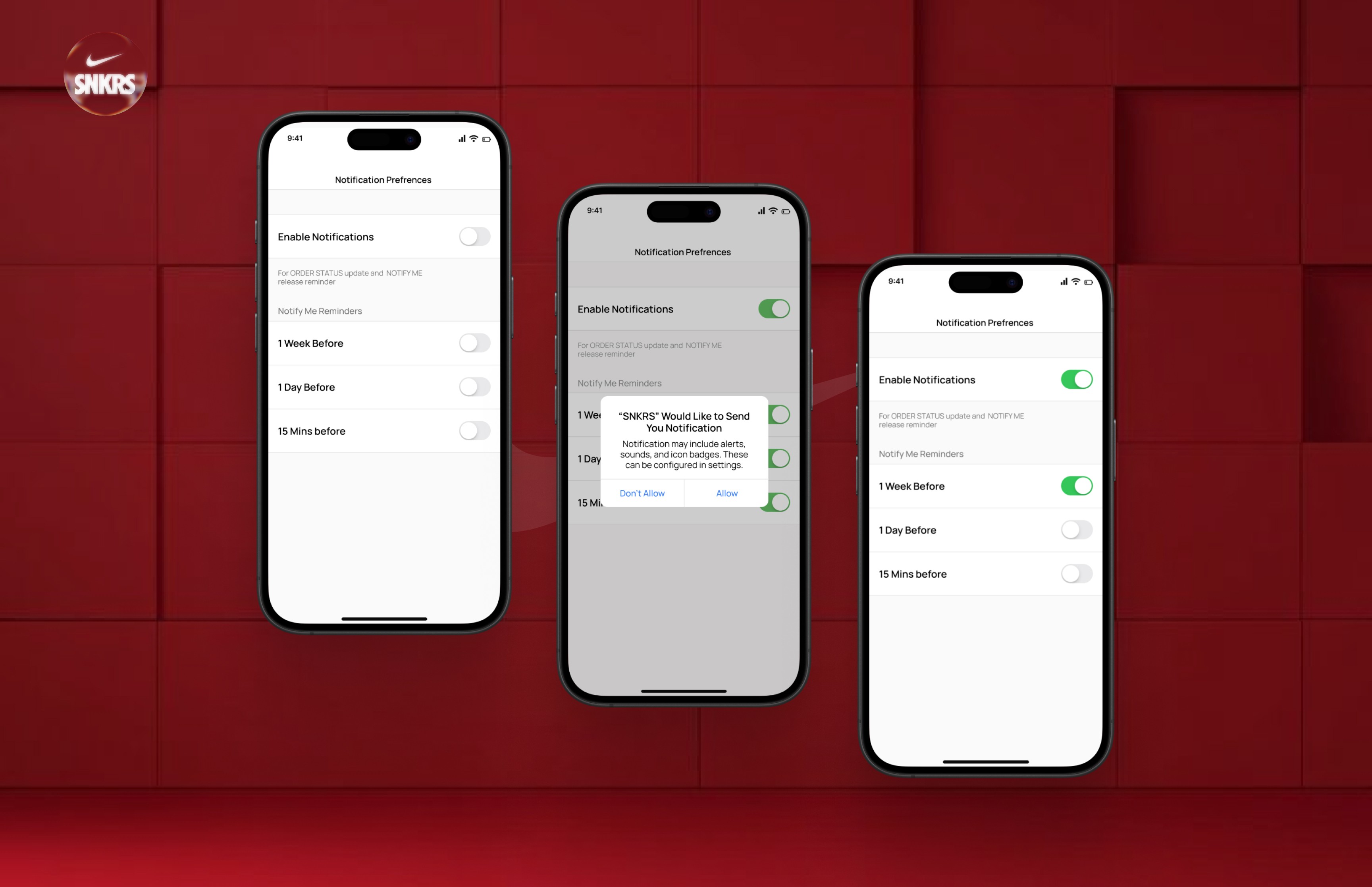
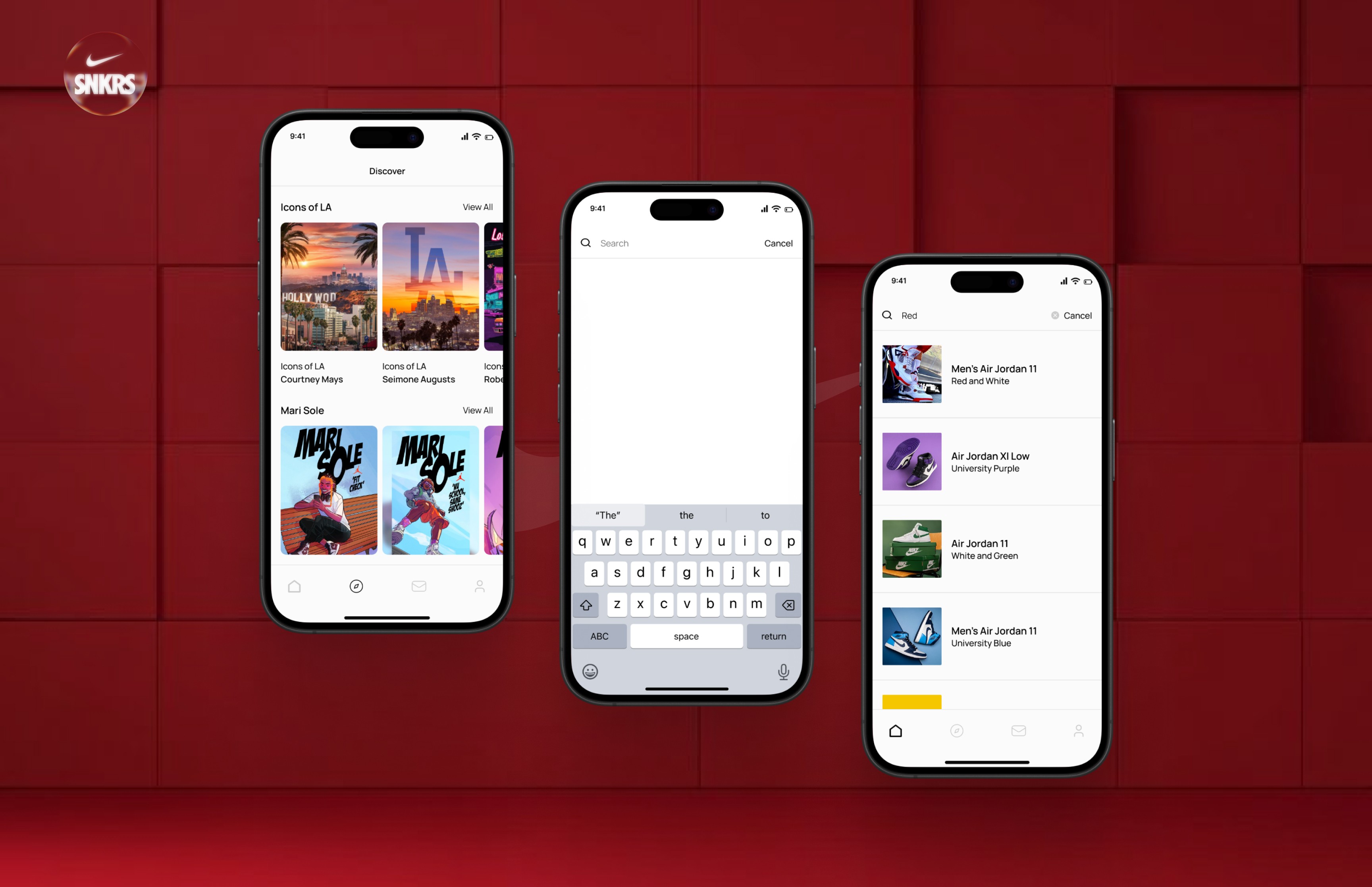
This redesign project aimed to improve the overall user experience of the Nike Shoes mobile app. The focus was on creating a cleaner interface, smoother navigation, and a more intuitive shopping journey. Key goals included simplifying product discovery, making the checkout process more seamless, and aligning the design with Nike’s bold and energetic brand identity. The result is a modern, user-centric app that enhances engagement and boosts user satisfaction.
Challenge
Cluttered Interface: The original app had a visually heavy layout, making it difficult for users to focus on key actions like browsing or purchasing shoes.
Complex Navigation: Users struggled to find specific products quickly due to deep and inconsistent menu structures.
Unclear Product Presentation: Product pages lacked clarity in layout and hierarchy, affecting decision-making.
Lengthy Checkout Process: The checkout flow had too many steps, leading to high drop-off rates.
Simplified UI: Redesigned the interface with a clean, minimal aesthetic to improve visual hierarchy and focus on core content.
Streamlined Navigation: Introduced a more intuitive tab-based structure and smart filters to help users find products faster.
Enhanced Product Pages: Improved layout with better imagery, clearer CTA buttons, and easy access to key details like sizes and reviews.
Optimized Checkout Flow: Reduced the number of steps and added progress indicators to make the purchase process faster and user-friendly.